How many people on your project can't read your colour-coded drawings?
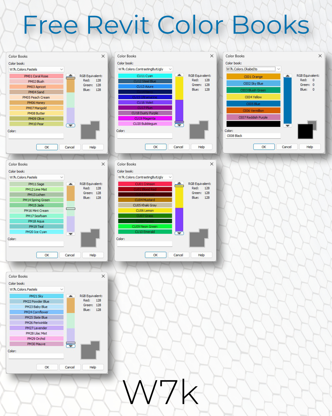
After one too many rounds of manually choosing colours in Revit, I decided to build myself a set of ready-to-use colour books.
We often need to communicate information quickly: wall types, façade types, construction phases. Yet assigning colours always seems to become a guessing game. Are these two different enough? Will anyone be able to tell them apart?
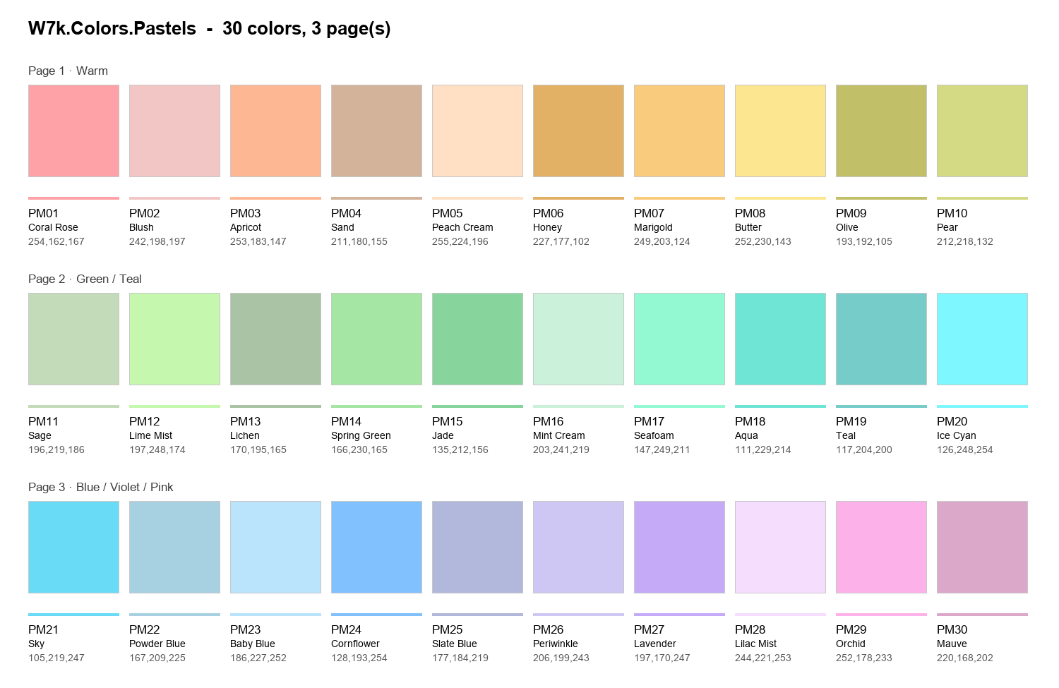
Palette 1 – Pastel
My first solution was a palette of 30 pastel colours spaced with mathematics across the whole RGB. Select a colour, apply it, and the drawing looks good. Less time fiddling with shades, more time designing. Something any architect working on planning drawings, concepts or early schemes can appreciate.
Palette 2 – Maximum contrast
Then I started asking a different question: how could I make these drawings easier to read?
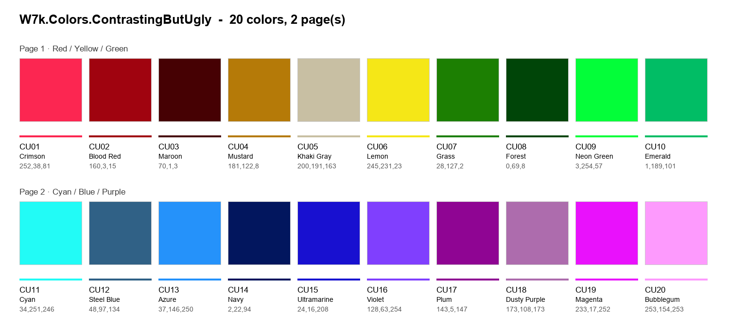
I created a second palette of 20 colours, mathematically generated to be as far apart as possible. They range from light to dark, so they differ in brightness as well as hue.
Pretty? Not particularly. Readable? Much more.
But readable for whom?
Palette 3 – Okabe–Ito
What about people on our projects with colour vision deficiency?
Around 1 in 12 men and 1 in 200 women have some form of colour vision deficiency.[1] In an industry where roughly 90% of the workforce is male, that could mean around 1 in 14 people on a typical project.
While researching this article, I came across a study from a Skanska UK project. Of the staff who responded to an anonymous survey, 24% said they were colour blind, and many reported difficulty reading reports that relied on colour.[2] In a wider survey, more than three in four colour blind workers reported frustration or delays at work because of their colour blindness.[3]
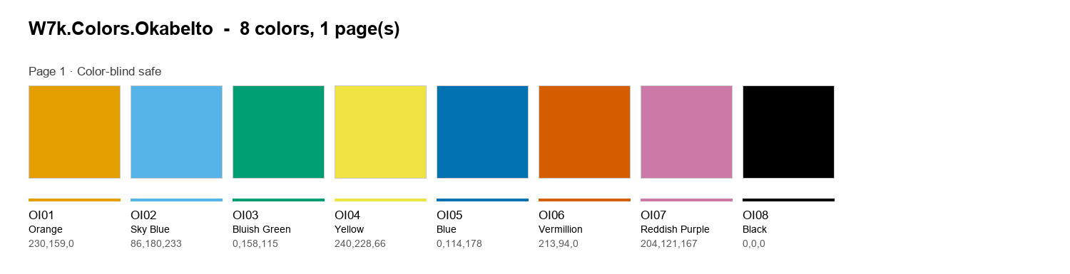
That led me to my third palette: an implementation of the Okabe–Ito palette, designed to help people with different forms of colour vision deficiency distinguish between colours. It contains only 7 colours but often it is enough.
Because a drawing can look clear to its author while being difficult for someone else to interpret.
Download
I’ve now made all three Revit colour books freely available on GitHub. You’ll find installation instructions, a script to speed up the process, and more information about each palette.
A small change to the way we work could make our drawings easier for more people to use.
GitHub link: https://github.com/W7k-J/W7k.RevitColors
Download ZIP: W7k.RevitColors.zip
References
- UK Government Design102, Colour Blind Awareness Day: design102.blog.gov.uk
- Considerate Constructors Scheme, Skanska UK, “Providing Reports for Colourblind Employees”: ccsbestpractice.org.uk
- EnChroma workforce survey (2021): enchroma.com