ProFM - Brand Identity
Creating a brand identity for ProFM, a facility management company
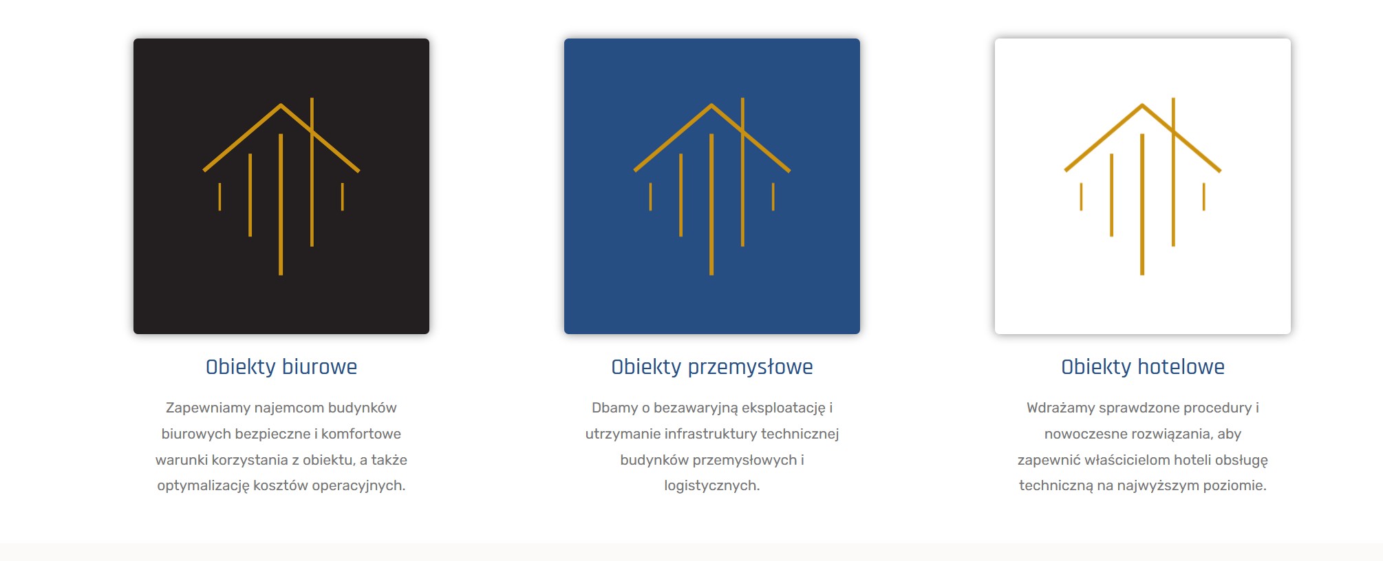
ProFM is a company that provides facility management services for offices, industrial and hospitality sectors. They have a wide range of interests and rich experience in their field, but they lacked a consistent brand identity. That’s where I came in. We started working by creating a logo that reflects their values and vision. The final version resembles a “home”. It conveys many connotations, just to name a few: warm, “feels like at home”, sense of peace and security.
For the main logo we decided to use gold, blue and white which symbolize excellence and expertise. We also added a subtle font to show the elegance and professionalism of ProFM’s services. Next, we selected a colour palette that conveys their rich offer. We decided to use different colours for each sector.
Finally, we applied the brand identity elements to some mock-ups of ProFM’s profiles, business cards, brochures and uniforms. We made sure to keep a balance between consistency and creativity, using the same fonts, colours and symbols throughout, but also adding some variations and details to make each item unique and appealing. The result is a brand identity that showcases ProFM’s expertise and versatility and helps them stand out from their competitors. I am very proud of this project! I hope it will help ProFM grow their business and reach new clients.
So, if you are looking for new managers for your properties, don’t hesitate to get in touch with them at Link!